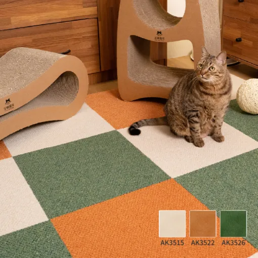
Short answer: read the room's fixed colors first, choose one dominant carpet neutral, and add no more than one accent until the layout works. For the lowest-risk result, keep the two carpet colors close in value. Use a stronger contrast only when you intentionally want a border or compact color block to be visible.
A five-minute way to choose the color family
- Photograph the room in daylight.Include the wall, main wood finish, sofa or bedding, and curtains. Those large surfaces matter more than a small accessory.
- Find the existing undertone.Warm wood and cream usually give you a warm starting point. White, charcoal, black metal, and cool gray suggest a cooler one.
- Choose one dominant tile.Plan 70-100% of the rug in a neutral that belongs with the fixed surfaces. This color should still work if the accent is removed.
- Add one controlled accent.Use a neighboring tone for a checker, a darker tone for a border, or four accent tiles as a single block. Then preview it from the doorway.
The test is not whether two swatches look attractive side by side. The test is whether the finished 160 x 200 cm rectangle connects the furniture and still leaves the room easy to read. If the carpet becomes the first thing you notice, reduce the contrast or the number of accent tiles.
Six carpet tile color combinations to try
Every recipe below is a 4 x 5 rug: 20 tiles, 160 x 200 cm (about 5.2 x 6.6 ft). The English color names are the working labels used in our designer. Click a recipe to load the exact collection, dimensions, color distribution, and model-code count.


1. Warm neutral checker
10 Linen + 10 Almond. Use this with pale oak, cream upholstery, warm white walls, and natural textiles. The colors are close enough to keep the checker quiet while the AK35 texture still gives the floor depth.
Open this AK35 palette
2. Dark wood border
6 Ivory + 14 Walnut. This is the strongest contrast in the guide. Use it when dark wood furniture already anchors the room and you want the rug edge to read clearly. If the border feels heavy, swap the quantities and make Ivory the outside field.
Open this AK35 palette

3. Cool gray checker
10 Mouse Gray + 10 Iron Gray. A practical starting point for white walls, black metal, gray upholstery, or a home office. The close gray pair makes the tile rhythm visible without introducing another hue.
Open this AK35 palette
4. Natural green accent block
16 Ivory + 4 Mugwort. Use the green as one 2 x 2 block rather than scattering it randomly. It works best when the room already contains plants, muted green textiles, or natural wood, so the accent has something to answer.
Open this AK35 palette

5. Light AK27 checker
10 Snow + 10 Sand Gray. This is the cleanest light pair for buyers who prefer AK27's 5 mm cut pile and pet-focused features. Place the lighter tiles away from food, outdoor shoes, and the busiest chair path when practical.
Open this AK27 palette

6. Cream with a blue accent
16 Cream + 4 Rain Blue. Repeat the blue only when it already appears in art, bedding, curtains, or upholstery. Four tiles create a readable accent without turning the whole small-room floor into a high-contrast checker.
Open this AK27 paletteMatch the palette to the room signal
| What is already in the room? | Low-risk starting palette | Why it works |
|---|---|---|
| Pale oak, cream, warm white | AK3578 + AK3580 | Two related warm neutrals |
| Walnut or dark stained wood | AK3565 + AK3568 | A deliberate light center and dark frame |
| White, charcoal, black metal | AK3551 + AK3552 | Cool contrast without adding a new hue |
| Plants and natural textures | AK3565 + AK3569 | One compact green accent block |
| Light room with pets | AK2701 + AK2716 | Quiet AK27 neutrals with cut pile |
| Blue textiles or artwork | AK2702 + AK2721 | The accent repeats an existing room color |
Checker, border, or accent block?
A checker distributes both colors across the whole rug. It is safest when the colors are neighbors in lightness and temperature. A sharp black-and-white effect emphasizes every 40 cm module; a Linen-and-Almond or Mouse-Gray-and-Iron-Gray checker lets the grid recede.
A border makes the finished rug outline more obvious. It can connect dark furniture to the floor, but it also gives the rectangle a stronger visual edge. Use it when framing is the goal, not as an automatic way to make a room feel larger.
An accent block concentrates the second color in one place. Four tiles out of twenty is enough to repeat a green or blue already present in the room. This is easier to control than a random layout and easier to revise later by moving or replacing four pieces.
For more pattern structures, continue to the checker, border, stripe, and color-block rug guide. If the footprint is not fixed yet, calculate it first with the 40 cm carpet tile calculator.
Do not judge the final color from the screen alone
Online swatches are useful for making a shortlist, but they are not a substitute for the installed material. Screen brightness, daylight direction, warm or cool lamps, nearby wall colors, and the pile itself can change what you perceive. TOLI's technical manual also warns that turning the backing-arrow direction can make the same product appear to have a different shade, and that production-lot differences can affect color.
For current AK35 and AK27, TOLI specifies checker direction: adjacent tiles alternate by 90 degrees. That intentional change in pile direction is part of the look. Lay the first few pieces, view them from the doorway and the main seat, then continue the direction pattern consistently.
Before a large international order: confirm the exact model codes, current stock, close-up material imagery, available sample options, and that all pieces come from the confirmed order. Keep one or two spare tiles from the same order for future replacement.
AK35 or AK27 for a small room?
The tile count is identical because both current collections use 40 x 40 cm modules. AK35 offers 16 colors and a 3-5 mm multi-level loop pile in solution-dyed polypropylene. It is the easier place to begin for layered warm neutrals and a textured, quiet room.
AK27 offers 14 colors and a 5 mm cut pile in BCF nylon. TOLI lists stain-resistant and deodorizing treatments and describes the cut pile as less likely to catch pet claws. It is useful when a pet household, stronger accent, or cut-pile feel matters more. Read the full AK35 vs AK27 comparison before deciding by color alone.
Final color checklist
- The main carpet color works with the wall, wood, and largest furniture.
- The accent repeats a color already present or solves a clear layout problem.
- The 160 x 200 cm outline has been tape-tested on the actual floor.
- The pattern still looks balanced from the doorway and main seating position.
- The backing-arrow direction is planned consistently.
- Physical appearance, stock, lot, floor compatibility, and optional spares are confirmed before payment.